Tutorial: Responsive Template, How to have a good design?
April 16, 2015 | 2145 Views
In previous article, you introduced various solutions to tackle mobile layout issues that many Social Network owners are facing. In this article we’re going to give you in-depth view of Responsive Design template solution which we hope will help you have some idea about Responsive template and how it works.
So, to get started, we’re going to answer the very first question.
What is Responsive Design?
As you’ve known from previous article, Responsive Design is an approach to web aimed at crafting sites to provide an optimal viewing experience—easy reading and navigation with a minimum of resizing, panning, and scrolling—across a wide range of devices (from desktop computer monitors to mobile phones)
Websites with responsive design tend to keep their general design across different devices and only the layout that is different depending on screen size.
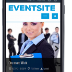
- Phone
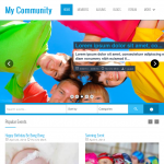
- Desktop
- Tablet
Now you know what it is. You might be wondering how it works? You’ll find your answer below
Most layouts used by responsive web pages can be categorized into one of five patterns: mostly fluid, column drop, layout shifter, tiny tweaks and off canvas. In some cases, a page may use a combination of patterns, for example column drop and off canvas
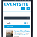
- Phone
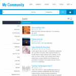
- Desktop
With the help of CSS3 and Javascript, layout is automatically adjusted to fit nicely on small screens. Of course due to limited screen size, some columns will be dropped to make place for more important columns which usually contain main content of a whole page. Some other elements are adjusted such as image size, font size etc.
Responsive Design relies on preprocessors to construct static css file from a dynamic stylesheet file. So, why not create static css file instead? Dynamic stylesheet files contain CSS like block formatting syntax with the use of variables, nesting, mixins, operators and function. This greatly enhances customization and modification because changes in one place also affects other areas which helps maintaining color scheme and general design easily without having to modify attributes of css selectors.
So, what is responsive design good for?
Apparently, it makes websites look good on various devices. It’s probably cheaper to use responsive design template than creating 2 different templates one for mobile devices and another for desktop. Having 2 different templates is a pain in term of maintenance since any change made to one must be made to the other. Meanwhile, with Responsive Template, changes are only made to one template which is easier to manage. Another benefit is that it maintains general design across different devices with minimal maintenance effort.
If you are interested in using Responsive Template for your Social Network, we have a couple of beautiful templates that would totally blow you away: Responsive Clean, Responsive Event and Responsive MetroUI


